Offline plotting, a.k.a. InSpectra Gadget
Offline plotting can be opened from the Anaconda prompt with
qcodespp offline_plotting
or from Jupyter notebooks with
qcodespp.offline_plotting()
If you have declared qcodespp.set_data_folder('foldername') in the same notebook, data from that folder will automatically be opened. Alternatively, you can write qcodespp.offline_plotting(folder=path_to_folder) to open a different folder. Otherwise, the initial state is blank.
Looking for a summary of mouse actions and keyboard shortcuts?
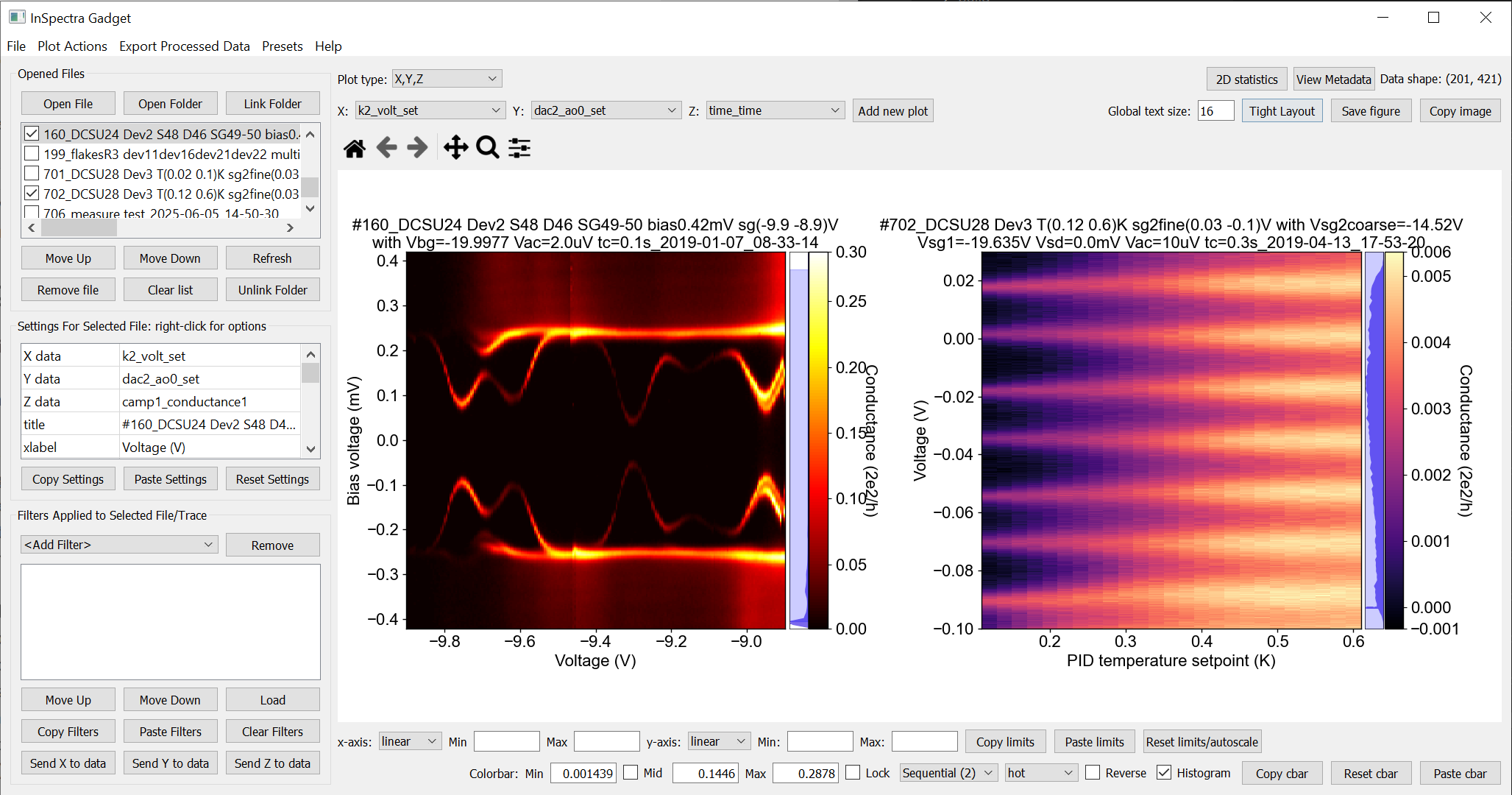
Basic plotting
Load data by clicking ‘Open File’, or by opening/linking a folder.
1D data is plotted as lines, and 2D data as a color plot. 3D data collected by qcodes++ can be decomposed into multiple 2D datasets; you will be prompted for options.
To change the plotted parameters, right click on the parameter name under ‘Settings for Selected File’ (for 2D data) or ‘1D traces’ (for 1D data).
Immediately above the plot windows are the usual matplotlib tools for panning and zooming. Reset the view with the ‘home’ button.
You can also zoom using mousewheel scrolling. To zoom only one axis, hover over it, or hold ctrl(shift) for x(y).
You can pan one axis at a time by clicking and dragging it.
‘Settings for Selected File’ changes the plot appearance. Right click to choose from preset values.
Axes settings (inc. for the colorbar) are underneath the plots.
The colorbar is accompanied by a histogram. To adjust the range of the colorbar, change the limits of the blue shaded region by clicking and dragging.
For 1D data, extra options will appear when the file name is clicked. You can add multiple lines from the same dataset to the same plot.
Linestyle and colour can also be changed by rightclicking.
Basic uncertainty plotting is supported for 1D data. For fixed values, enter the value, and for a percentage error enter e.g. ‘10%’. The uncertainties can also be loaded from another column in the dataset by right-clicking on the relevant cell in the table. (see below for how filters (do not) affect uncertainties).
A legend can be added for 1D data using the checkbox above the plot window.
You can also perform fits to 1D data.
You can save or copy the plot using the buttons in the top right corner or the shortcuts Ctrl+Shift+S, Ctrl+Shift+C. The saved pdfs work very well in Adobe Illustrator.
Plot types
Histograms and Fast Fourier Transforms (FFTs) of the data can be plotted by selecting the appropriate ‘Plot type’ at the top of the window.
For histograms, you can choose the number of bins either next to the ‘plot type’ menu (for 2D data) or line-by-line in the Traces table (for 1D data).
FFTs are plotted against the calculated frequencies. For this to be meaningful, the original data must be on an evenly-sampled grid. If this is not the case, apply an ‘Interpolate’ filter to the data, and click each of ‘Send X/Y/Z to data’ (not Z for 1D data). Then plot these filtered parameters and choose FFT as the plot type.
Fitting
The fitting is basically a GUI for lmfit, with almost all built-in models implemented. See here for a description of each model/function.
To limit the fitting range, fill out the Xmin and Xmax fields, OR, click twice on the plot area. Lower limit first, upper limit second. Further clicks will move the closest limit to the click position.
You almost always need to provide some ‘Input info’; might be the polynomial order, or the number of peaks to fit. The description in the Information box will guide you.
Optionally, you can provide an initial guess for the fit parameters. The initial guess can be very important.
If there is not a model suited to your needs, use ‘User input’/’Expression’. You can input anything you want and fit it!
The ‘custom’ models include some fits relevant for electron transport, using
lmfit.Model(docs). If you have a workingModelfor a function not included here, feel free to contact me via github or email (or even better, make a pull request!) and I will include it.‘Save fit result’ saves the fit result using
lmfit.model.save_modelresult(docs). You can uselmfit.model.load_modelresult('file_location')(docs) to load the fit result into a notebook for further analysis.You can fit all of the checked lines using the same fitting options using the ‘Fit checked’ button. You can save all the results as lmfit model results (I suggest making a new folder before saving!!).
Finally, you can also calculate statistics under ‘fitting’. This isn’t really fitting of course, it just calculates the listed values using the relevant numpy function (i.e. no lmfit involved). The statistics are saved as a .json file.
Filters
Filters in InSpectra Gadget are simply mathematical operations that can be performed on the data. The filters thus handle everything from applying offsets to any of the axes, to doing numerical differentiation, smoothing and interpolation.
You can add multiple instances of the same filter type, change the order they are applied in and turn them off and on.
You can export the data if you need to work with the results in another program/notebook.
You can also export the filters/settings, and load them later on other datasets.
Finally, and importantly, you can ‘send’ the filtered data to the current dataset, to plot it on another axis, or simply use it later.
Each available filter has up to two options. Hover over the relevant box in the app to see a description of the filter and its options, or consult the table below.
Filter type |
Option 1 |
Option 2 |
Info |
|---|---|---|---|
Order in x |
Order in y |
n-th derivative in x and/or y |
|
Integrate |
Order in x |
Order in y |
Numerically integrate the z data (for 2D) or y data (for 1D) n times along the x or y axis. Choice between the trapezoidal rule, Simpson’s rule and a rectangular approximation. |
Order in x |
Order in y |
Perform the cumulative sum n times along the array axis. Similar to integrating if the grid is regular. |
|
window in x |
window in y |
||
window |
polynomial order |
Savitzy-Golay smoothing/filtering applied along the selected axis |
|
Add/Subtract |
value |
n/a |
Add/subtract a fixed value to any axis. Also available by right-clicking on plot area as ‘Offset <axis> by X’. To add/subtract another parameter from the same dataset, right click on the offset value. To subtract, place a ‘-’ in front of the parameter name. |
Multiply |
factor |
n/a |
X*factor; useful to convert e.g. V to mV. To multiply by another parameter from the same dataset, right click on the value to choose. |
Divide |
factor |
n/a |
X/factor. To divide by another parameter from the same dataset, right click on the value to choose. |
Add slope |
slope in x |
slope in y |
Slope is multiplied to x and/or y. Useful to e.g. subtract series resistance |
Invert |
n/a |
n/a |
perform 1/x, 1/y or 1/z |
Normalize |
x-coordinate |
y-coordinate |
Normalise z-data (or y-data if 1D) to min, max, or specified point |
Subtract average |
n/a |
n/a |
Subtract average of data from data |
Offset line by line |
index |
n/a |
For each line in a 2D dataset, subtract the value at the given index, within that line. Used if you know that the n-th index of each line should be zero. |
Sub. ave. line by line |
n/a |
n/a |
For each line in a 2D dataset, subtract the average of values in that line. |
Subtract trace |
index |
n/a |
2D data only. Subtract the linetrace at the given index from all other lines in the data. |
Logarithm |
base |
n/a |
logarithm to base 10, 2 or e (default 10). The Mask, Offset and Abs options deals with negative values. ‘Mask’ ignores them, ‘Offset’ offsets all data by the minimum value in the data, and ‘Abs’ takes the absolute value of the data. Only for z data; for x,y use axis scaling below plot window |
Power |
exponent |
n/a |
performs x^exponent |
Root |
root exponent |
n/a |
performs abs(x)^(1/exponent) if exponent>0 |
Absolute |
n/a |
n/a |
Absolute value of data |
n/a |
n/a |
Flips the data along the x-axis (1D) or y-axis (2D) |
|
# of points in x |
# of points in y |
Interpolate onto a regular grid with the given number of points. 1D uses scipy.interpolate.make_interp_spline, 2D uses scipy.interpolate.griddata. |
|
Sort |
n/a |
n/a |
Rearranges the data such that X or Y is sorted in ascending order. |
position |
amount |
Rolls the data in x by the given amount, starting at the given position |
|
position |
amount |
Rolls the data in y by the given amount, starting at the given position |
|
Crop X |
minimum x |
maximum x |
Not just zooming; relevant if e.g. you want to apply a filter only to a section of the data. Available also by right-clicking on the plot window |
Crop Y |
minimum y |
maximum y |
(2D data only) As above |
Cut X |
left |
width |
Similar to Crop, but uses array index, and uses min and width rather than min and max. |
Cut Y |
bottom |
width |
Similar to Crop, but uses array index, and uses min and width rather than min and max. |
Swap X/Y |
n/a |
n/a |
Swaps the x and y axes of the data, i.e. plots y as a function of x and vice versa |
Filters and uncertainties
Since it is extremely non-obvious how various filters may affect uncertainties in different situations, only Multiply and Divide filters are applied to uncertainties (basically to facilitate unit scaling). In general, if you are performing any of the above operations, you should re-calculate your uncertainties manually. If the filter can be applied to the uncertainties, and the uncertainties are another parameter in the dataset, plot the parameter, copy over the filters, and then use ‘Send Y to data’ button to make the processed data available for plotting as an uncertainty. Otherwise, process the uncertainties as required, open them as a new dataset, and combine the two datasets.
Filters and plot types Plot type is applied before the filters. If you want to plot the histogram or FFT of filtered data, use the appropriate ‘Send X/Y/Z to data’ button(s), plot the filtered data, and then choose the plot type.
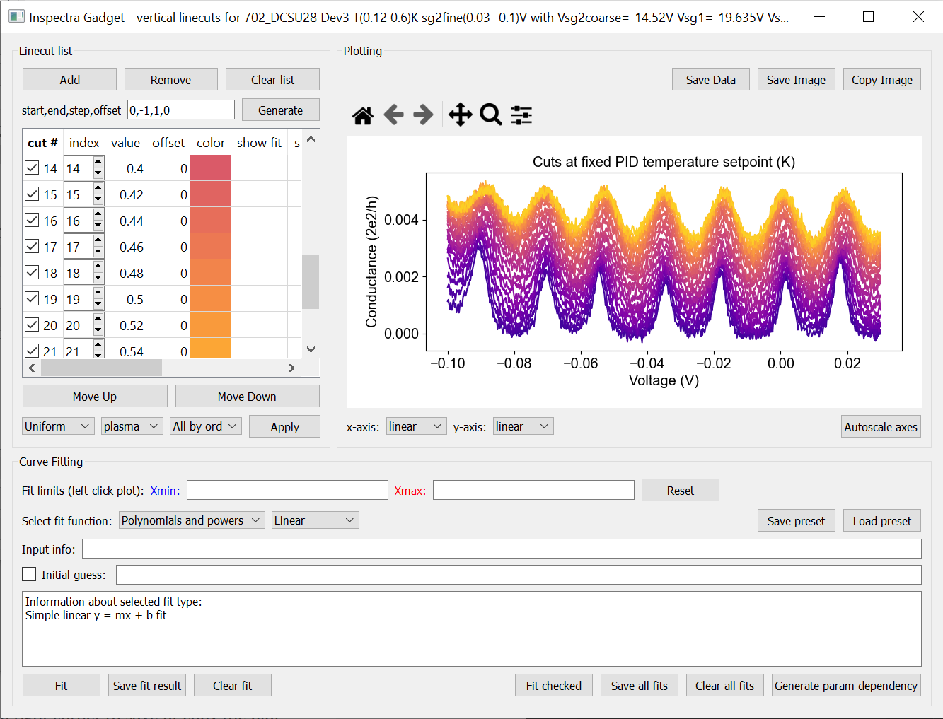
Linecuts
To make a horizontal(vertical) linecut, left-click(middle-click) at the desired location on the plot.
Alternatively, right click on the plot area and choose from the menu; diagonal linecuts are also available.
You can change the index at which the cut is made, the offset on the y-axis, and the colour of the line.
You can add further cuts by clicking again, or manually adding them in the linecut window.
For diagonal linecuts, add further cuts from the right-click menu or the linecut window.
The endpoints of diagonal linecuts can be moved by clicking and dragging. Hold Ctrl to move the endpoints together.
To generate a series of linecuts, specify (the indices) start, end, step and y-axis offset. Use -1 as end index to call the last index. It’s probably not a smart idea to plot every line if you have hundreds of lines; it will use a lot of memory and won’t look good anyway.
Once you have your linecuts, you can also apply a colourmap to their linecolors by selecting which colormap to use, how to apply it, and clicking ‘Apply’
You can (re-)access the linecut windows from the ‘Plot Actions’ menu, by right-clicking on the plot area, or by the shortcuts Ctrl+Shift+H, Ctrl+Shift+G, Ctrl+Shift+D for horizontal, vertical, and diagonal linecuts, respectively.
You can copy and paste linecuts (‘Plot Actions’ menu or Alt+C, Alt+V); horizontal and vertical linecuts are copy/pasted according to their index, while diagonal linecuts are copy/pasted according to their coordinates.
Fitting linecuts
Fitting linecuts is almost the same as in the 1D plotting case except…
You can ‘Generate a parameter dependency’; i.e. create a file which has the value of the parent axis as one column, and all fit parameters as the other columns. The file is automatically added to the file list in the main window. You can then plot each fit parameter as a function of the parent axis’ variable.
Working with multiple files
To open another data file, just click ‘Open File’ again. Data from the new file will be plotted.
To see data from both files side-by-side, activate the checkbox next to the original file. You now have two plots!
To change the spacing between the plots and the whitespace above and below, use the middle mouse scrolling when hovering over the relevant region.
IMPORTANT: To set values such as labels, z tick parameters, axis ranges, first either click on the filename corresponding to the plot you want to edit (not the checkbox) or somewhere on the plot area, to bring the correct file/plot/data into focus.
To change the order of the plots, you change the order of the files in the list using ‘move up’ and ‘move down’.
To add a new plot with different sets of parameters from the same dataset, use the X,Y,(Z) boxes above the plot window and click ‘Add new plot’. This duplicates the file in the file list. You can do this manually by right-clicking on the file and choosing ‘Duplicate’, or with Ctrl+D.
Duplicating a file will not carry over any linecuts or fits. It is quite hard to implement. If it really becomes relevant I can look into it.
Working with an entire folder
You can open data from an entire folder in two ways.
You can select ‘Open Folder’ and choose the relevant folder. This will load the list of all the datasets found in that folder and all sub-folders. The data itself will not be loaded until you click the checkbox to plot it. This is because the data gets loaded into memory, which might start to affect your computer’s performance. However, unchecking a file does not free up memory. ‘Remove file’ and ‘Clear list’ should do it, but this is hard to troubleshoot. Certainly refreshing the kernel works.
You can also ‘link’ to a folder with ongoing measurements by clicking ‘Link Folder’. Initially this will perform the same action as ‘Open Folder’, but now when you click ‘Refresh’, any new data will be added automatically to the list of Opened Files.
Combining datasets/plots
There are three ways to combine datasets:
1D data: an arbitrary number of datasets can be combined; all parameters from all datasets are available for plotting. It will not be possible to plot parameters from different datasets against each other unless the arrays have the same length.
2D data: an arbitrary number of datasets can be stacked along the x-axis. The number of parameters and their names must be the same, and the y-axis dimension must be the same for all datasets. Any other situation would require interpolating along the y-axis; you should do this manually and then load the file (see below for how to prepare non-qcodes++ data)
One 2D dataset and one 1D dataset: Makes it possible to plot lines/points ontop of the 2D dataset. No restriction on dimensions, but only supports one dataset of each type. If you need to add more than one dataset of a particular type, first combine those using one of the previous two options.
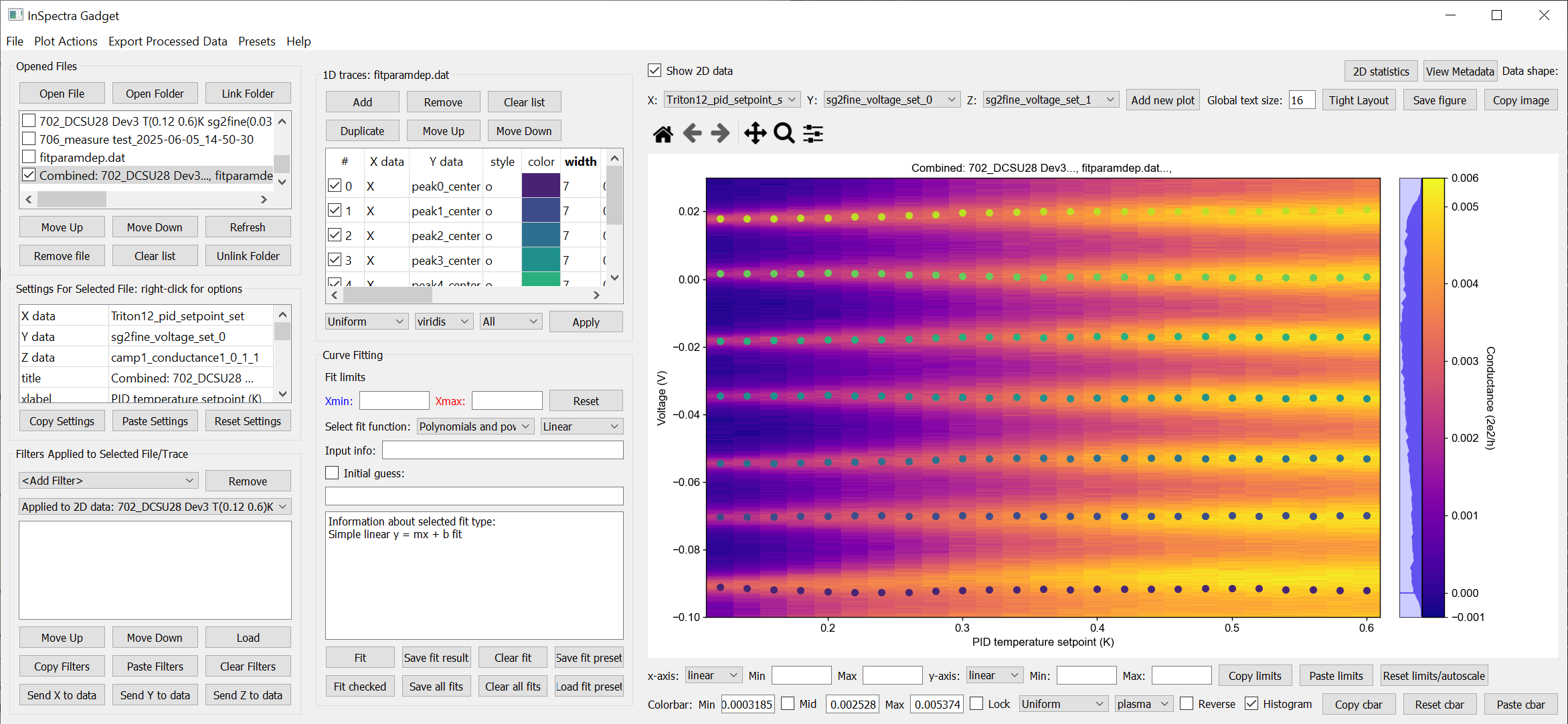
A combined 1D and 2D dataset. To produce this plot, the peaks in the previous image were fitted to seven Lorentzians at each temperature. The parameter dependency was generated, and after combining this with the original 2D dataset, the peak centers were plotted ontop of the 2D data.
Saving and loading
You can ‘Save Session’ and ‘Restore Session’ in the ‘.igs’ format from the ‘File’ menu. The raw data is not saved, rather the filepath is saved, and the data reloaded upon Restore. If the filepath changes (e.g. you moved the data, or are loading the session on a different computer), you will be prompted to find the new data location. The program will then try to load all the data by looking at the new relative filepath, so even if you have 1000 files, you should only have to manually relocate one of them.
Exporting data and filters
If you need to do further analysis in another program/notebook, export the data using the ‘Export processed data’ menu. You can save in .dat, .csv or .json format. For python, .json is likely the best choice, because it does not have the limitations of numpy .dat files, and is easily loaded as a python dictionary using
import json
with open('filename.json') as f:
    data=json.load(f)
2D data exported as .json can be loaded into a notebook using data=qcodespp.load_2d_json(filename). This returns a dictionary with the data reshaped correctly.
Limitations in the numpy .dat formatter places limitations on what 1D data can be exported to .dat. Fits will not exported, and combined 1D files cannot be exported unless all arrays are of the same length. These limitations do not exist for .csv and .json.
Saving and loading appearance presets
You can save the current state of the appearance settings from the ‘Presets’ menu.
Loading non-qcodes++ data.
If you have x, y and z data that is plottable by matplotlib’s pcolormesh, you can use qcodespp.export_2d_to_IG(x,y,z,filename). This will save a numpy .dat file importable by InSpectra Gadget.
Otherwise, manually shape the data and save it as a .dat file compatible with numpy genfromtxt using e.g. numpy.savetxt('filename.dat',data) (docs).
For 1D data, supply a series of columns of equal length. If the data gets loaded by IG with rows and columns swapped, e.g. you get 300 columns and 4 rows when you should have 4 columns and 300 rows, set ‘transpose’ to True under ‘Settings for Selected File’. The program will re-import the data and swap the meaning of rows and columns.
For 2D data, the data again must be columns of equal length, with each column belonging to a single parameter. The independent parameters must be in the first and second columns to be interpreted correctly. A basic example:
0   0.1     1.2
0   0.2     1.3
0   0.3     1.4
0   0.4     1.5
0   0.5     1.6
1   0.1     1.4
1   0.2     1.5
1   0.3     1.6
1   0.4     1.7
1   0.5     1.8
2   0.1     1.6
2   0.2     1.7
2   0.3     1.8
2   0.4     1.9
2   0.5     2.0
The program knows the data is 2D purely by the fact that the first two values in the first column are identical.
By contrast, the below is interpreted as 1D data since the first two values in the first column are different:
0.5     0.1     1.2
0.45    0.2     1.3
0.4     0.3     1.4
0.35    0.4     1.5
0.3     0.5     1.6
0.25    0.1     1.4
0.2     0.2     1.5
0.15    0.3     1.6
0.1     0.4     1.7
You can supply any number of dependent parameter columns, but of course only two independent parameters.
To automatically name the columns, you can use a header. Start the first line with ‘#’ and list the parameters:
# Voltage Temperature Conductance
The default delimiter is any white space. If necessary, specify the delimiter under ‘Settings for Selected File’ to reload the data with the appropriate delimiter.
Cheat sheet
Mouse actions |
|
|---|---|
Zoom |
Scroll. Hover over axis or hold Ctrl(Shift) to zoom only x(y) axis. |
Pan |
Click and drag on axes. Or select four-arrow icon and click-drag on main plot. Other mouse actions are disabled while this icon is active. |
Adjust whitespace |
Scroll in whitespace; scrolling inbetween plots adjusts spacing, scrolling around the plots changes the border size. |
Horizontal linecut |
Left click on 2D data or Ctrl+Shift+H |
Vertical linecut |
Middle click on 2D data or Ctrl+Shift+V |
Diagonal linecut |
Right click on 2D data and choose ‘Diagonal linecut’ or Ctrl+Shift+D |
Move diagonal linecut |
Click and drag endpoints. Hold Ctrl to move endpoints together. |
Set fit limits |
Click twice on 1D data. Lower limit first, upper limit second. |
Change fit limits |
Click again; the closest limit will be moved to the click position. |
Change plotted params |
Right click on the parameter name under ‘Settings for Selected File’ (for 2D data) or ‘1D traces’ (for 1D data). |
Use preset values |
Right click on the relevant cell in the relevant table. |
Duplicate a file |
Right click on the filename, or use Ctrl+D, or use ‘Add new plot’ above the plot window.’ |
Keyboard shortcuts |
|
|---|---|
Open file |
Ctrl+O |
Open folder |
Ctrl+Shift+O |
Link folder |
Ctrl+L |
Unlink folder |
Ctrl+Shift+L |
Refresh data from linked folder |
Ctrl+Shift+R |
Track data from linked folder |
Ctrl+T |
Save session |
Ctrl+S |
Restore session |
Ctrl+R |
Save plot |
Ctrl+Shift+S |
Copy plot |
Ctrl+Shift+C |
Duplicate file/plot |
Ctrl+D |
Open horizontal linecut window |
Ctrl+Shift+H |
Open vertical linecut window |
Ctrl+Shift+V |
Open diagonal linecut window |
Ctrl+Shift+D |
Copy all linecuts |
Alt+C |
Paste linecuts |
Alt+V |
Show/hide linecut markers |
Ctrl+M |
Background
The offline plotting interface was largely developed by Joeri de Bruijckere with the excellent name InSpectra Gadget (because bias spectroscopy of quantum dots was the original use case). Matplotlib is used as the backend, in contrast to live plotting, which is based on pyqtgraph. Matplotlib is far more powerful and feature-rich, but it is therefore also big and bulky, meaning the offline plotting interface doesn’t have the same responsiveness, nor the same data tracking speed as live plotting. Both plotting methods have the downside that they only accept rectangular arrays as data. For more complex dataset, you need to write your own code, or reshape the data. The offline plotting module might even crash if it gets data that it does not like. In general there are more bugs in the offline plotting, since it is more complicated/powerful. If you find one, please report it via GitHub issues (preferred) or email, including the error log (available from the ‘Help’ menu).
A note about fitting
Fitting real data an analytical expression is nowhere near as trivial as it first looks. Curve fitting works by minimising the difference between the values in the real data, and the values produced by an analytical equation. For functions with many parameters, there can be many points in the parameter space where a local minima in the difference between data and function can be found. This means the fit may return non-physical values if the ‘wrong’ minima is found. Therefore, providing a good initial guess is very important; it increases the chance of finding the ‘right’ local minima. If you don’t provide an initial guess, an initial guess is provided either by the built-in lmfit estimates or by InSpectra Gadget. Usually they’re pretty good guesses (since good initial guesses are almost always related directly to the data limits) but do not trust them. You must check to see if the fitted values are sensible and adjust the initial guesses if not.
Finally, and very importantly!!: The ability to constrain fit parameters is (currently) unavailable in this software, but can be extremely important in fits with lots of parameters. If you have more than 5 fit parameters, I strongly suggest you do NOT use this software to fit your data. Fitting such complicated data is non-trivial, and you should really spend the time to carefully construct a custom fitting procedure using lmfit, sherpa or miniut.